

Sadly, no-one buys your product because you’re such nice people, they buy it because ultimately it makes their lives easier.
From that perspective, documentation needs to be about them, not your product. What you want is for them to have a shock of recognition – Oh, company X gets my job. They made this product for me. Your features need to matter to them.

If you understand how the users at your clients are trying to make their supervisors happy, then you can explain:
- Why it will make their lives easier
- What tasks it will help them accomplish.
Good user training and education does several things:
- It makes your product sticky, eliminating client turnover.
- It turns your users into sales agents – happy users singing your praises is a good thing. As they move about the industry, bring the good news about you with them to other companies.
- It can become a source of revenue with upsells of courseware or supplemental training such as webinars, seminars or certification. It is also a point of ongoing contact so your account managers can keep an ear to the ground at clients.
A Final Word
Think about users in your documentation and the UI. One recent client used colours largely decoratively but some key indicators would definitely cause problems for the ten per cent of men who are colour blind.
To them green and red would appear to be shades of brown
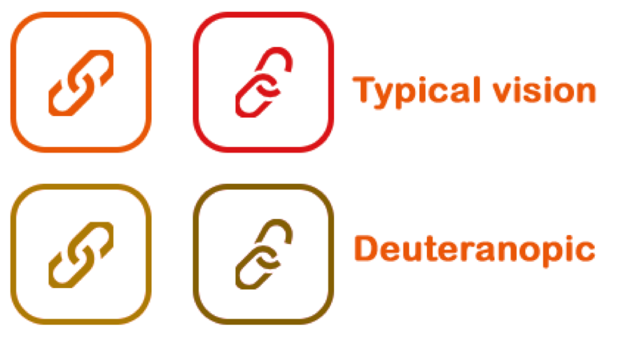
Here’s another example, a link indicator would look orange or red to a person with normal vision but just different enough to someone red nonstandard vision that communication difficulties might result.
Take the time to make sure that your documentation is accessible.